

Needs a Starter license.
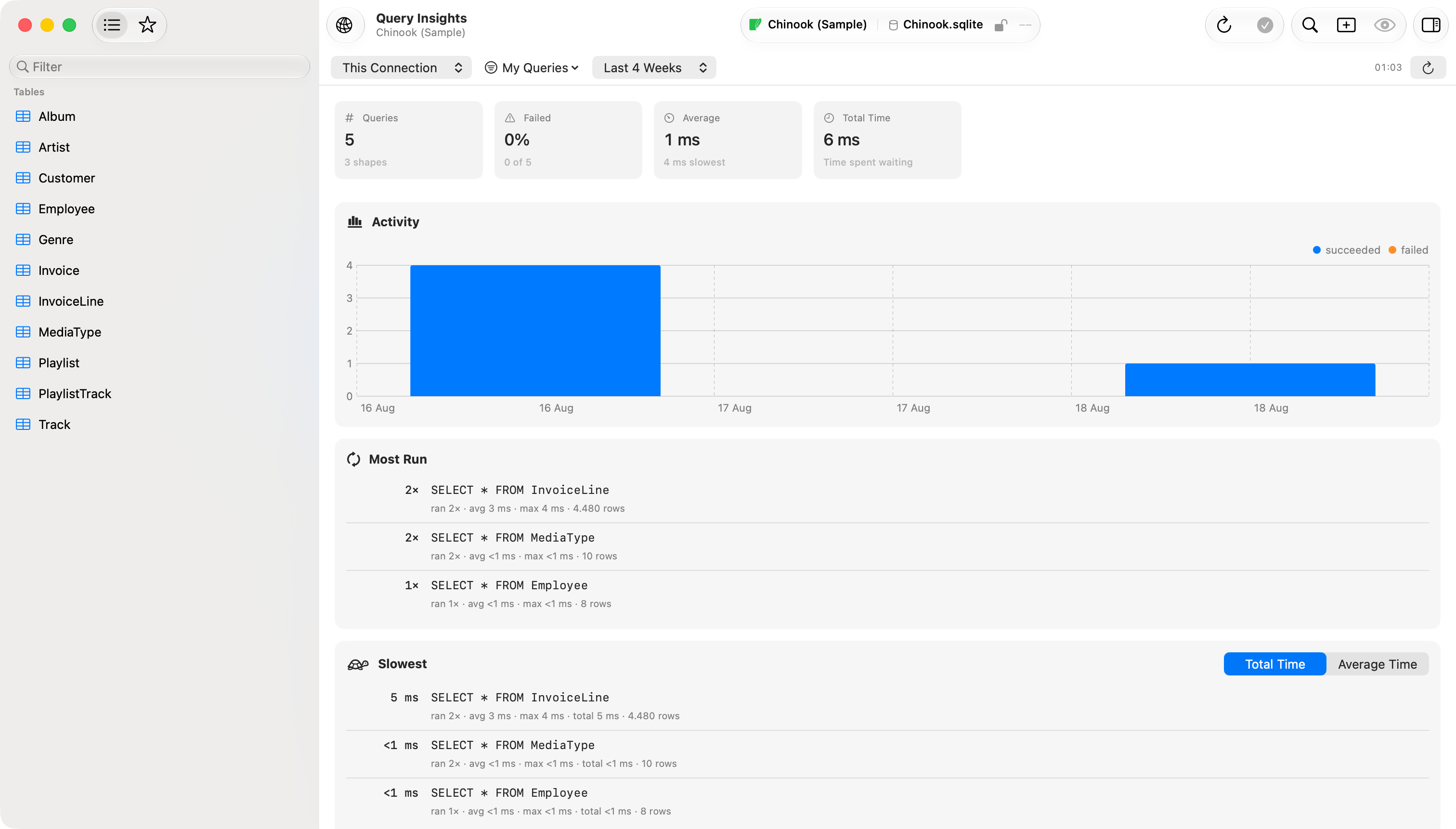
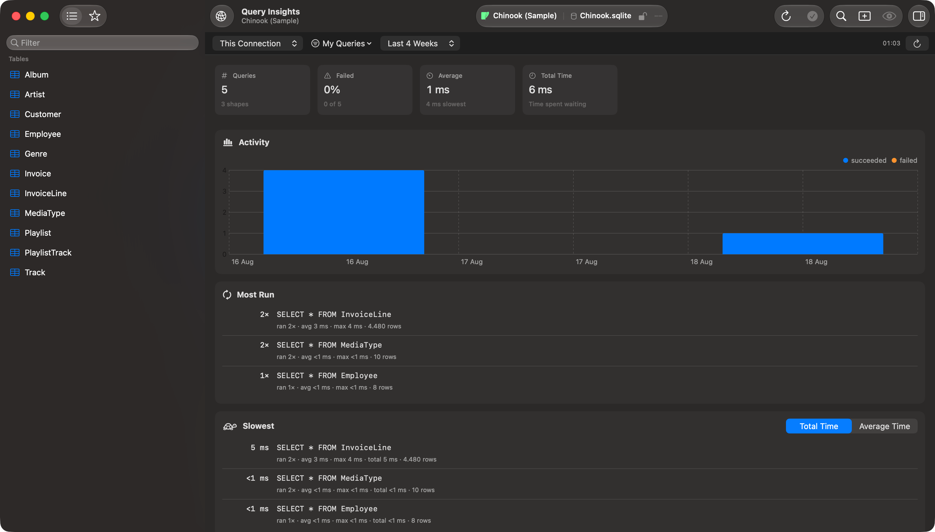
Query Insights: summary, activity chart, and the ranked panels below it
The panels
Each ranked panel lists the top 10 shapes. Right-click a row for Copy Query and Load in Editor: both give you the most recent real query in the group, values and all, from a run the row is actually counting, so the connection, sources and date range you picked all apply. In Failures it comes from the run that produced the error beside it.Summary
Across the top: how many queries ran, what share failed, the average duration, and the total time spent waiting.Activity
Queries per day, split into succeeded and failed. A range of two days or less is charted by hour instead.Most Run
Shapes ranked by how many times they ran.Slowest
Ranked by Total Time by default, which finds the query that actually costs you time: usually a quick one you run constantly rather than a slow one you ran once. Switch Rank By to Average Time for the query that is slow every time. Average Time lists only shapes that ran at least 3 times.Got Slower
Compares the range you picked against the range immediately before it, so Last 7 Days compares against the 7 days before that. An unbounded range compares the last 7 days. A shape is reported when all three hold:- it ran at least 5 times in both periods
- its average got at least 50% slower
- its average grew by at least 25 ms
Failures
Shapes ranked by how many times they failed, with the most recent error message for each.What to do with a finding
A row in Slowest or Got Slower is a shape, not a diagnosis. Load in Editor puts a real example in a query tab, whereCmd+Option+E gives you the execution plan: see Explain Visualization.
Durations are measured on this side of the wire, from sending the query to getting the result, so they cover network time and any SSH tunnel as well as the server. For server-side timings, locks and running queries, see the Server Dashboard.
A shape ranked high under Table Browsing came from the app paging or sorting a table, not from anything you wrote.
How shapes are grouped
Values are stripped out of every statement and what is left is the shape:
This is the same idea as PostgreSQL’s
pg_stat_statements and MySQL’s statement digest, so the numbers mean what they mean there.
Two things stay apart: table and column names keep their capitalization, since Orders and orders are different tables on a case-sensitive server, and a number inside a name stays part of it, so events_2025 and events_2026 are counted separately.
Filtering
Source defaults to My Queries, the SQL you wrote yourself, and uses the same source list as the history drawer. Date defaults to Last 4 Weeks rather than All Time, since “got slower than before” needs a before to compare against. There is no outcome filter.
Insights refreshes as you run queries. The refresh button is for when you want it now.